|
By Skip Ploss
 As
a Web designer for the last nine years I have been blessed
with the opportunity to watch an industry and technology grow
from hip tech to appliancetude. Yes I made that up. Appliancetude
is the state in a technology's lifespan when the public's
perception of it makes the leap from mysterious and slightly
dangerous to being a toaster. As
a Web designer for the last nine years I have been blessed
with the opportunity to watch an industry and technology grow
from hip tech to appliancetude. Yes I made that up. Appliancetude
is the state in a technology's lifespan when the public's
perception of it makes the leap from mysterious and slightly
dangerous to being a toaster.
That's right, a toaster, or stove or washing machine or telephone
or newspaper. Something you just use without thinking about
how or why. If you want toast, you stick a piece of bread
in the slot and push the button down. You don't give any thought
to how it works, how the electricity goes in and heats up
the wire elements crisscrossing the insulating board on both
side of your Freihofer's 12 grain, you just use it. That's
what the web has become as well, for the most part.
I talk to a lot of people about web design. To many, if you
ask my wife. When the person I am talking to is a small business
owner the question that inevitably comes up first is, "do
I need Flash on my home page?" The second most popular
question I get is, "don't I need more stuff to fill up
my home page?"
I know from whence these questions come. We are a media generation.
Not satisfied with listening to the news being read to us
on Fox now we need to read other news in a small band scrolling
across the bottom of the screen at the same time while another
icon rotates the Fox News Logo in the corner, as the stocks
and weather are shown somewhere else on the screen. People,
your kid's, your friends, your uncle, will all tell you that
your website needs to be "cool". This is usually
followed by a quick trip around the internet where the "guide"
shows you all of the "cool" sites they have come
across. These usually involve animations, music, buttons that
go "bing" etc. That's fine. The fact of the matter
is that for small and medium businesses the primary mission
of a website is, to paraphrase Thomas Jefferson in the Declaration
of Independence, "To place before mankind the website
owner's goods and services in a format so clear and concise
as to command their purchase/use."
 Lets
go back to the toaster for a sec. When you approach the toaster
you have one task in mind, to make toast. If you live in a
household like mine this may be "to make toast fast".
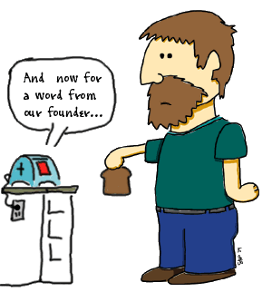
This time however you have the new "cool" toaster
with the touch screen display on the front. You place your
two slices of Arnold Toasting Bread into the slots and go
to press the "Toast" button. As your finger approaches
the screen the toaster starts a movie about the history of
the toaster company with sound. There is a speech by the company's
founder made in 1923 before the National Convention of the
ATMA (American Toaster Manufacturing Association). The movie
is breathtaking and you find yourself wondering if they had
Ken Burns make the film for your toaster. Wait a minute, all
you wanted to make toast. You give up and grab a Yoplait out
of the fridge and head for the door while your toaster plays
Ashokan Farewell (from Ken Burns "The Civil War"
mini series on PBS) in the background. Lets
go back to the toaster for a sec. When you approach the toaster
you have one task in mind, to make toast. If you live in a
household like mine this may be "to make toast fast".
This time however you have the new "cool" toaster
with the touch screen display on the front. You place your
two slices of Arnold Toasting Bread into the slots and go
to press the "Toast" button. As your finger approaches
the screen the toaster starts a movie about the history of
the toaster company with sound. There is a speech by the company's
founder made in 1923 before the National Convention of the
ATMA (American Toaster Manufacturing Association). The movie
is breathtaking and you find yourself wondering if they had
Ken Burns make the film for your toaster. Wait a minute, all
you wanted to make toast. You give up and grab a Yoplait out
of the fridge and head for the door while your toaster plays
Ashokan Farewell (from Ken Burns "The Civil War"
mini series on PBS) in the background.
It's the same with your website. Think of it as an information
appliance. The user has come to your web address for a specific
reason; one your designer helped you to clarify. In most cases
that mission is to give the viewer enough information to simply
show the them that you exist and what it is that you offer.
This is particularly true of small business. More and more
the public uses the small business website as an enhanced
yellow pages advertisement. As a way of answering the question
"Can I get [insert your product or service] here in town?"
If they have to sit through an interactive presentation first
they may leave. You need a site that makes the path to your
information, whether it be the hours and location of your
store or the services your consultancy offers, clear and quick.
Remember, all you wanted was toast.
Is there a place for "interactives"? Absolutely.
We'll discuss that in a later note.
|


